Banking that reads in one glance.
Accounts, transfers, offers and the compliance details nobody notices until they're missing. This is the in-house work our founder shipped at TD Bank before starting LoopSuit.
Don't make people lose their place.
The whole idea in 60 seconds, one product decision at a time.
Three years on a bank app used by millions.
Before LoopSuit, our founder spent three years as a UI / Product Designer on TD Bank's in-house team, designing the US app for iOS and Android.
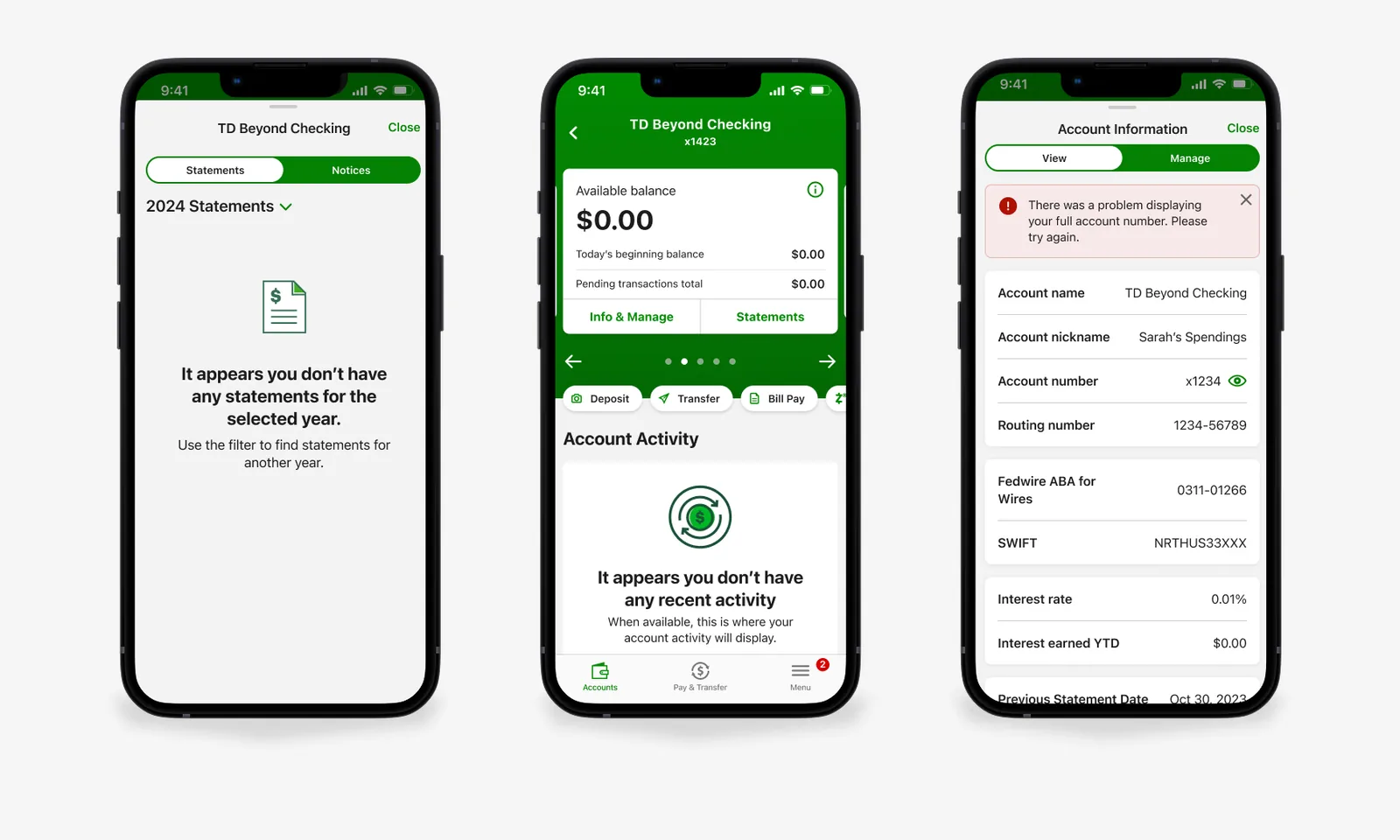
The account screens, straight from the Figma designs.
Pending and posted, grouped by day.
Every detail one tap from the list.
Balances first, actions in reach.
A home for products and offers.
Zelle®, bill pay and transfers.
Tabs and menu, restructured.
A clear opt-in for e-statements.
Compliance UI, designed in.
He also contributed to TD's design system: components, patterns and the universal header. The phones on this page are rebuilt in HTML from those designs, with demo data.
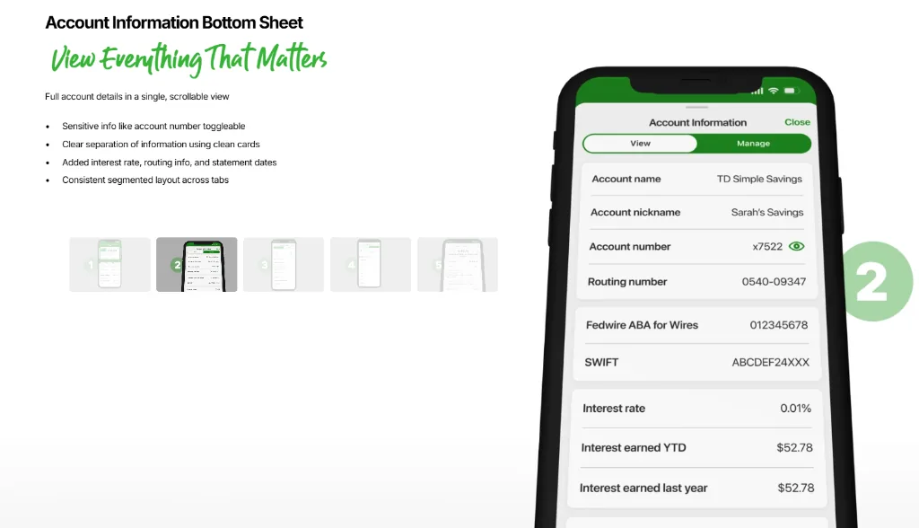
Details in a sheet, not a new page.
Account numbers, routing details and paperless settings open in one bottom sheet, so nobody loses their place in the activity list.
Statements for x1423 go to your secure inbox. You can switch back any time.
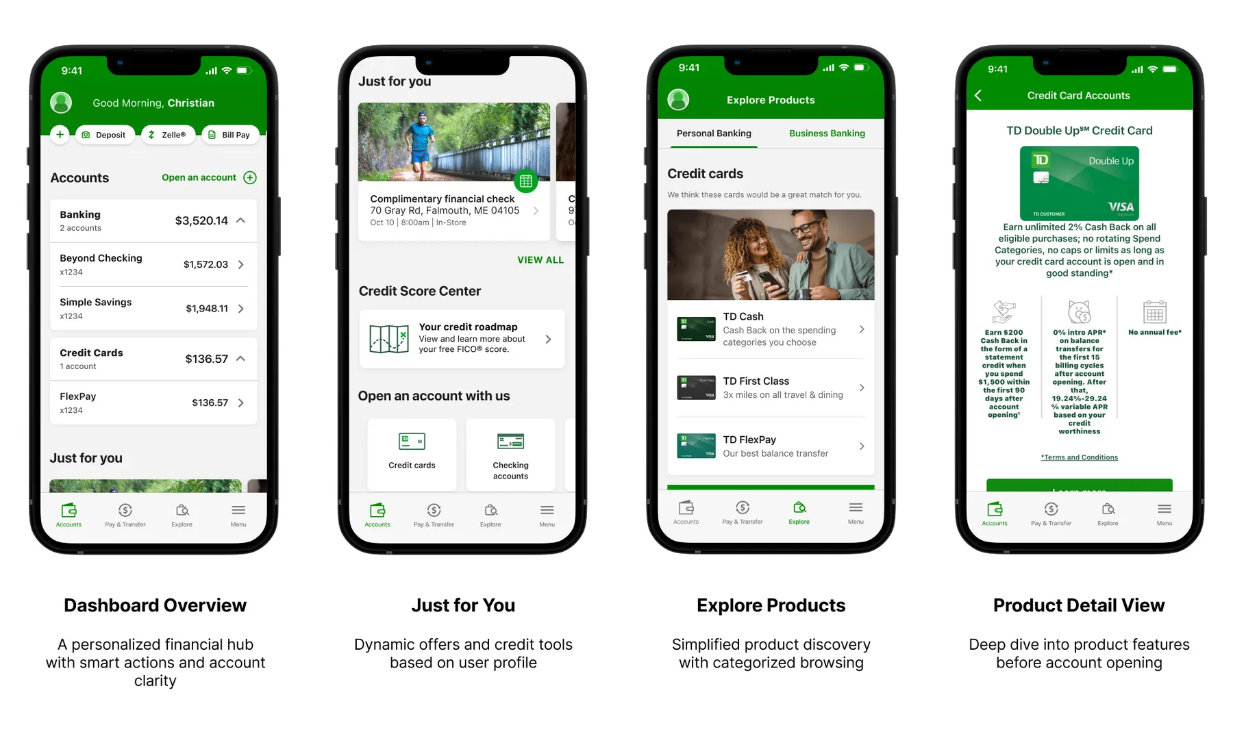
A home screen that sells without shouting.
Offers and new products got their own tab, Explore, instead of fighting the balance for attention.
 1
2
3
4
5
6
7
- 1Deposit, Zelle® and Bill Pay live in the header, on every visit.
- 2Balances group by type and collapse, so long lists stay short.
- 3Offers move into their own rail, away from the money.
- 4The credit roadmap sits one tap from home.
- 5Explore splits Personal and Business before anything else.
- 6One line per product: the name and why it fits you.
- 7Benefits first, fine print one link away.
Pick a person, type an amount, send.
The Zelle® flow keeps the recipient, the account and the fraud warning on one short path, with a review step before any money moves.
Tap through the real Figma flow.
The account activity prototype, end to end, as it was handed to engineering.
Loads from Figma. Click, then tap through the screens.
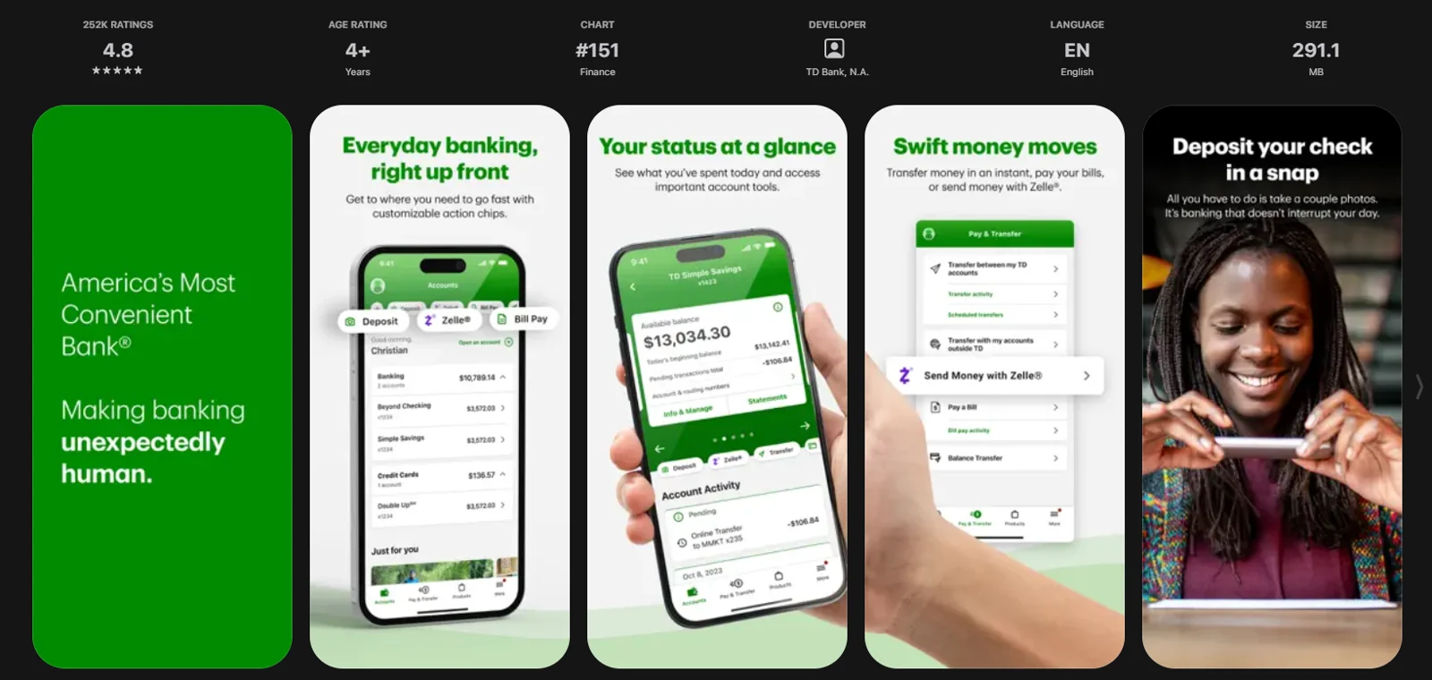
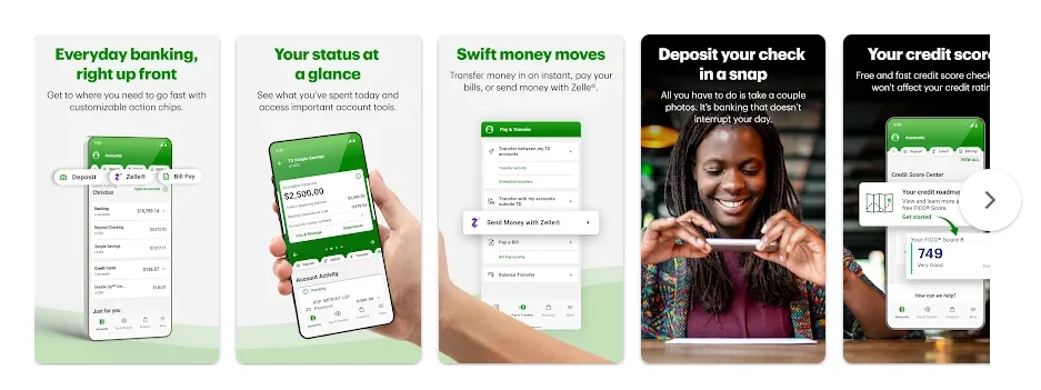
The first screen is the store listing.
The listing graphics had to explain the app before anyone downloaded it. These are the ones that shipped.
"In a bank app, the empty states and the disclosures get designed as carefully as the balance."What three years at TD taught us, and why every LoopSuit build ships with its edge cases done.
Want bank-grade design on your product?
The same care for edge cases, compliance and clarity now goes into every app we design and build. Start with a free 20-minute call.